Median prices at

Curve Subtypes (TNs)
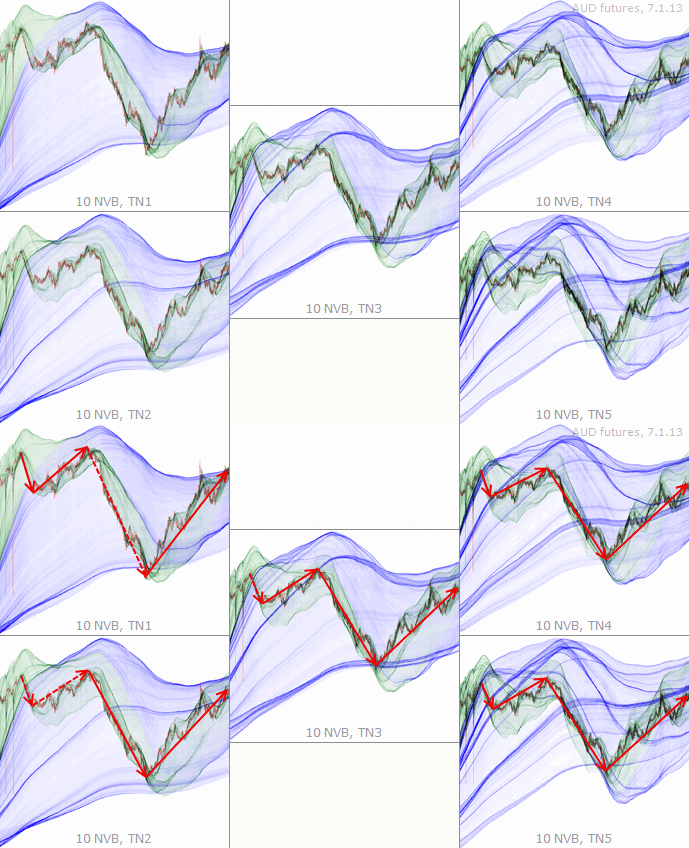
TzaraNet’s topological network exists under different subtypes (TNs™), each one corresponding to a different regression curve order. What is remarkable is that the same topological structures within the network of a given chart keep appearing in varying intensities and in more or less deformed ways throughout the subtypes.
This property can be exploited, to better understand the interactions between the price and a specific topological structure, by confronting the same chart under two or more TNs. Sometimes, even though counterintuitive, the same topological structure under different TNs plays different roles in relation to the price.
This simple example presents the same chart under all five TNs. The arrows showing successive average price movements let us see that some characteristic figures are common to all the TNs.
Sometimes, some characteristic figures are not present in lower TNs, giving the false impression that some local extrema do not interact with the network. Higher TNs show that it is not the case.
Try to identify the major interactions of the price with the characteristic figures for each TN, and see how interactions from higher TNs can help "fill in the blanks" in TN1, for example.
On this image, these interactions are circled for each TN. When placing all the circles on, say, TN1, one can see how many local extrema are outside the scope of that TN.
This is another example of the great complementarity of TNs. As you can see, lower TNs tend to exhibit fewer characteristic figures and simpler topological networks than higher TNs.
By looking at the circles, one can see that each TN brings its own set of useful interactions. Here, there is not a single major interaction that is present on all five TNs.
It is impossible to say that one TN is superior to another. Sometimes, it is rather a lower TN, other times, a higher TN.
Judging by the number of highlighted interactions, all 5 TNs here bring a balanced share of important interactions of the price with characteristic figures.
Local extrema labeled with "?" interact minimally with TN1 characteristic figures or are outside the scope of TN1. Under TN2, these extrema strongly interact with characteristic figures.
When confronting the chart under TN1 and under TN4, it is clear that the TN4 characteristic figures account for most of the local extrema in this example.
In this TN1 chart, characteristic figures are scarce, leaving most local extrema in "empty space". This is when other TNs come in handy. Here, it is clear that TN3 accounts for most local extrema.
This TN1 chart has two very strong cords explaining the overall price movement. However, to understand the intermediate movements, the TN4 chart provides the answer.
This TN1 chart is sparse (few characteristic figures), but thanks to charts of higher TNs, we can see that all the local extrema interact with their characteristic figures strongly and accurately.
This price jump can be well understood and predicted in TN1. In order to make more accurate predictions, confrontation with higher TNs is necessary, as shown by the colored circles.
In the series that follows, the major interactions of all the TNs are superimposed on the bottom image. This allows one to see how rich the information provided by all TNs is.
All non-red highlighted interactions come from other TNs (other than TN1). Not many of them overlap with red circles or boxes.
One can see in this example that TN2 provides most of the interactions, and more of them than any other TN. This is of course not always the case.
A small number of important local extrema are in empty space on this TN2 chart, such as the second return to the major cord ("missed" only due to the presence of slightly higher TN1 cords).
The TN3 chart, even though displaying many local extrema in empty space, provides many of the most important interactions.
Very interestingly, these TN3 interactions happen to also be present in other TNs, which illustrates the fact that sometimes interactions are found in one TN, and sometimes simultaneously in more.
Here, the TN4 happens to be the least interesting, prediction-wise. It has though a couple non-unique (shared with other TNs) major interactions of the price with characteristic figures.
By looking at all the interactions superimposed, one can see only one unique major interaction under TN4. Interestingly, the TN4 interactions happen to be in the upper part of the network.
This TN5 chart has a lot of interactions, as it is often the case with higher TNs, which are richer in characteristic figures. This TN happens here to account for many price journeyings.
Some important interactions, including the price journeyings, are unique to this chart under TN5.
| This simple example presents the same chart under all five TNs. The arrows showing successive average price movements let us see that some characteristic figures are common to all the TNs. |
