Median prices at

Topological Network
TzaraNet is a dense network of curves derived from regression curves. It should be viewed as a topological structure in that it is all about shapes and not about metrics. However, the metrics, here the price, can be incorporated to the prediction a posteriori very easily thanks to the price scale.
The topological nature of this tool is a big advantage because the human brain is particularly efficient at dealing with shapes (since in the environment we evolved in, everything is about shapes and not metrics).
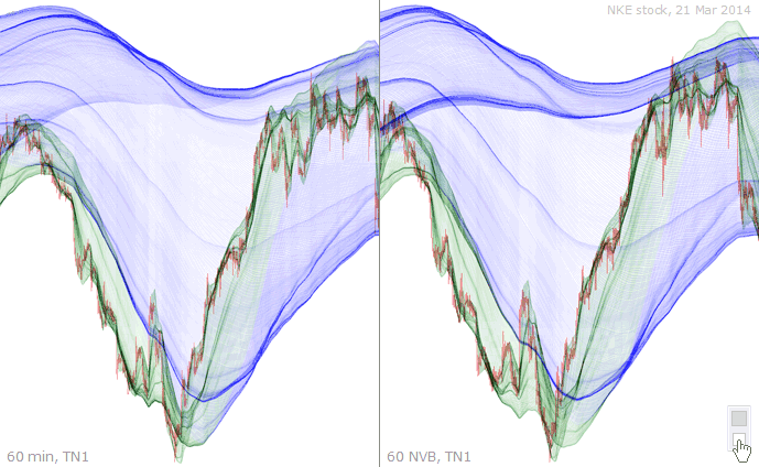
The notion of topological network can be easily understood when comparing the corresponding minute chart and NVB chart. The two charts are more or less deformed in relation to one another.
The colored dots are here to help you identify “equivalent” topological structures (one color per structure) in the two corresponding charts.
Interestingly, the equivalent topological structures sometimes play different roles in relation to the price, and this is not coincidental.
The orange dotted structures (observe the cords merging, in passing) play equivalent roles whereas the pink and green dotted structures play different roles.
The nonequivalent roles played by dotted structures are particularly evident here. Yet, the price interacts in a perfectly coherent, precise and predictable manner with the characteristic figures.
It is sometimes difficult to ascertain the equivalence of structures in corresponding charts. The yellow dotted structures, for example, do seem equivalent, but play completely different roles.
This is the same set of charts under TN1. Not only does it allow you to compare the two charts in terms of structures, but also to compare the charts between sets.
Same colored dots have been used on all four charts to mark equivalent structures. What is remarkable is that certain structures are found on corresponding charts, and also throughout TNs.
This example is interesting because it shows how equivalent structures can be much more pronounced and simpler in terms of interactions with the price in NVB than in minute.
The pink dotted cord illustrates this phenomenon perfectly. Notice the skinny, but well defined, cord underneath exactly parallel, playing an important role in NVB, but barely visible in minute.
Most, if not all, structures are present in both minute and NVB charts. This demonstrates the concept of the topological network. However, NVB charts tend to be superior.
Not only is the NVB chart superior overall under TN1, but under higher TNs, the NVB chart is also richer in terms of interactions of the equivalent topological structures with the price.
It is fascinating how relatively dissimilar price representations (minute versus NVB) lead to quite similar topological networks with easily identifiable equivalent structures.
Here, almost all the topological structures are more pronounced and interact more strongly and more accurately with the price in the minute chart than in the NVB chart.
Despite the theoretical implications, the more the price representations between minute and NVB charts are dissimilar, the more useful it is to confront them.
Equivalent topological structures can be found in corresponding minute and NVB charts, and NVB charts are usually superior. Sometimes though, it is the opposite, as in this example.
| The notion of topological network can be easily understood when comparing the corresponding minute chart and NVB chart. The two charts are more or less deformed in relation to one another. |
